Color is one of the most powerful tools in design. Before users read a word or understand a message, they feel a color. The psychology of colors explores how different hues influence emotions, behaviors, and perceptions — making it a critical element in branding, UI/UX, marketing, and visual communication.
Designers don’t choose colors randomly. Every shade sends a signal, whether it’s trust, urgency, calm, or excitement. Understanding color psychology allows designers to communicate intentionally and create experiences that resonate on a subconscious level.
How the Human Brain Responds to Color
Color perception is processed in the brain faster than text or imagery. Studies show that people form judgments about products and brands within seconds — and color plays a dominant role in that impression.
Color affects:
- Emotional response
- Attention and focus
- Memory and recognition
- Decision-making and conversion behavior
While cultural and personal factors influence perception, there are widely observed psychological patterns that designers rely on.
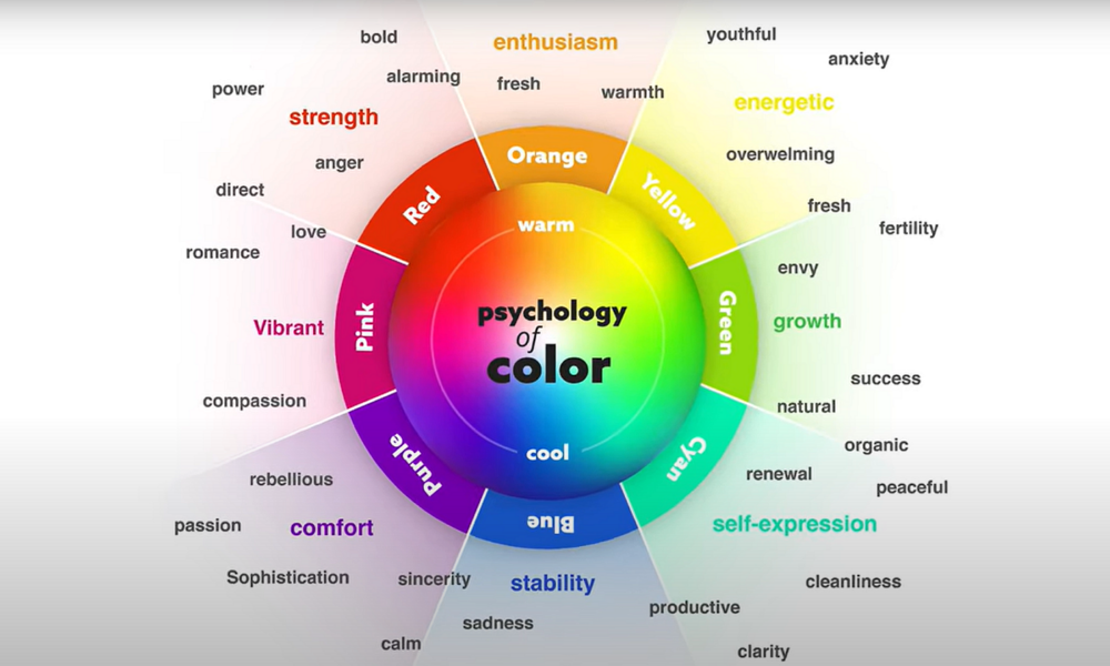
Warm Colors: Energy, Urgency, and Emotion
Red: Power, Passion, and Action
Red is associated with intensity, urgency, and strong emotion. It increases heart rate and draws immediate attention.
Common design uses:
- Call-to-action buttons
- Sales and clearance messaging
- Brands that want to convey strength or excitement
However, excessive red can feel aggressive or alarming if not balanced carefully.
Orange: Enthusiasm and Confidence
Orange blends the energy of red with the friendliness of yellow. It evokes enthusiasm, warmth, and approachability.
Used effectively in:
- Startups and creative brands
- Youth-oriented products
- Encouraging engagement without aggression
Yellow: Optimism and Attention
Yellow is linked to happiness, creativity, and optimism. It’s highly visible and grabs attention quickly.
Design considerations:
- Works well for highlights and accents
- Overuse can cause visual fatigue or anxiety
- Often used to signal freshness or positivity
Cool Colors: Trust, Calm, and Stability
Blue: Trust, Stability, and Reliability
Blue is one of the most widely used colors in corporate, tech, and financial design because it conveys trust and security.
Ideal for:
- Banking and fintech platforms
- Healthcare and technology brands
- User interfaces requiring clarity and calm
Lighter blues feel friendly, while darker blues feel authoritative.
Green: Growth, Balance, and Nature
Green is associated with growth, renewal, health, and success. It’s easy on the eyes and often used to reduce visual stress.
Common applications:
- Sustainability and wellness brands
- Finance and productivity tools
- Success indicators and confirmations
Purple: Creativity and Sophistication
Purple combines the stability of blue with the energy of red. It’s linked to imagination, luxury, and introspection.
Often used by:
- Creative industries
- Beauty and premium brands
- Products targeting innovation or self-expression
Neutral Colors: Balance and Structure
Black: Authority and Elegance
Black communicates power, sophistication, and exclusivity. It’s widely used in luxury branding and minimalist design.
White: Simplicity and Clarity
White symbolizes cleanliness, simplicity, and openness. It creates breathing space and improves readability in layouts.
Gray: Neutrality and Balance
Gray acts as a stabilizing color, often used to balance brighter tones and create hierarchy without distraction.
Color Psychology in Branding and Marketing
Brands use color consistently to build recognition and emotional association. Over time, specific colors become synonymous with certain brands or industries.
Key branding impacts:
- Improves brand recognition
- Shapes perceived brand personality
- Influences purchasing decisions
- Builds emotional trust with users
Consistency in color usage is just as important as the color choice itself.
Cultural and Contextual Considerations
Color meanings are not universal. Cultural background, context, and personal experiences can alter perception.
Examples:
- White symbolizes purity in some cultures, mourning in others
- Red may signal danger or celebration depending on context
- Green can represent prosperity or inexperience
Designers must research their audience and adapt color strategies accordingly.
Best Practices for Designers
- Use color to support function, not overwhelm it
- Maintain sufficient contrast for accessibility
- Limit primary palettes to avoid confusion
- Test color impact across devices and environments
- Align color choices with brand values and user intent
Effective color design balances psychology, usability, and aesthetics.
Conclusion
The psychology of colors is a foundational principle in effective design. Colors influence how users feel, think, and act — often without them realizing it. By understanding emotional associations, cultural context, and functional impact, designers can craft visuals that communicate clearly, persuade subtly, and resonate deeply.
Whether designing a brand identity, website, app, or marketing campaign, intentional color choices can elevate design from visually appealing to psychologically powerful.
Disclaimer
This article is for informational and educational purposes only. Psychological responses to color may vary based on individual, cultural, and contextual factors. Designers should test and validate color choices with their target audience.
Resources
- Research on color perception and emotional response in visual communication
- Design psychology studies from academic journals
- Branding and marketing case studies on color usage
- UX accessibility and color contrast guidelines
- Neuroscience research on visual processing and color recognition